Beyond Price Action

Hi Steven,
Thanks for the reply.

I don't doubt that having a sound understanding of statistics is likely to be helpful to all traders. That said, I presume you don't expect beginners or experienced traders alike to take a minimum of one - and preferably two - 20 week classes in statistics simply in order to be able to understand your methodology? ;)

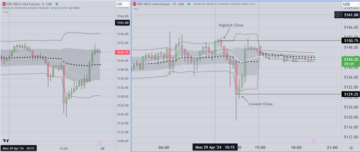
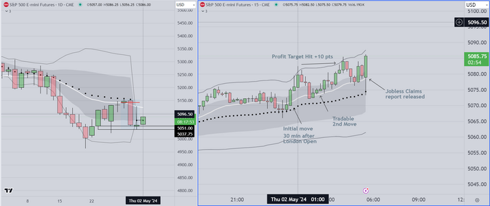
Re, VWAP - I plotted it at the start of last Mondays session to cover the entire week - as you specifically refer to weekly VWAP in your previous post. So, you're now recommending a daily VWAP plotted at the start of each session - is this correct?

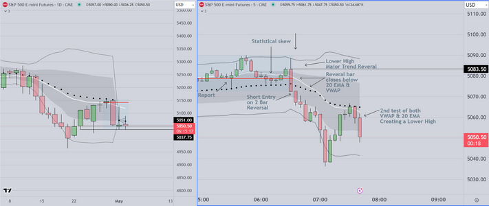
You write: "If the POC is above the VWAP the skew is down, conversely if the POC is below the VWAP the skew is up." That's clear enough, but you don't mention where price is in relation to the two indicators. Is it relevant - does it matter?
Tim.
Hello

Now that I have advised you as to how to prepare, I have no further concern. Choose as you wish

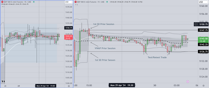
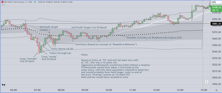
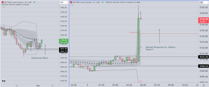
As regards whether to use weekly or daily data for the higher time frame chart, It doesn't matter
Markets are fractal, so you can use either time frame.

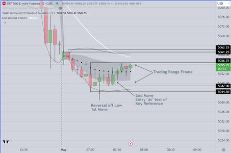
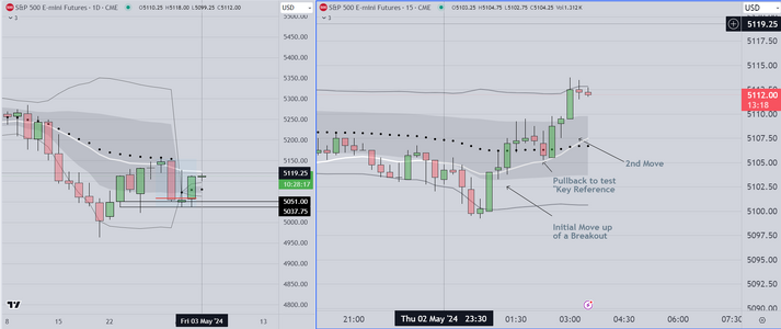
As regards price action relative to skew. for a positive skew, you want price to be trending up. and
For a negative skew, trending down. When the POC is at or very near the VWAP, there is no statistical
tendency up or down Traders with a background in stats, characterize this as a "symmetrical" or
"Trading Range" market, requiring knowledge of how to trade using limit orders. I don't expect to
be posting long enough to cover that subject matter.
 
Before I stop posting I want to attach a chart showing the basic "framing" format for
Trading Range days. The framing process is straightforward. I monitor price action
until I identify the "day type" as either a trend day or a trading range day. Based on
some very simple rules, I can do this accurately (about 90% of days) within the first
15-30 minutes

Once I identify a "Trading Range" condition I begin to markup my chart is a specific
way. Simply put I extend horizontal lines from the highest and lowest closes, AND
I move those lines as the high & low closes change.

I also monitor for price to exceed the 1st & 2nd standard deviation bands.

The entry process is simple to describe but difficult for amateurs to execute.
Once price exceeds the 1st or 2nd SD Band, I will enter as price moves back
into the envelope. My stop loss is above or below the high or low, and my
profit target is two tiered. The first target is at the VWAP median, the next
target is the opposite 1st SD band. There are nuances of course, but I am
not going to have time to elaborate. The general principle is that trading
range days are very forgiving, and if price DOES exceed the 1st or 2nd
SD band, it is not going very far.
 

Attachments

  • Trading Range Example 4-29-2024.PNG
    Trading Range Example 4-29-2024.PNG
    121.2 KB · Views: 22
Although I will try to maintain a presence here., I am trying to complete documents for my Blog ("Beyond Price Action"
and I have a responsibility to several clients as well. So here is an example of how the London Market could be traded
(when volatility permits).

As seen in the charts attached, on the left is an hourly chart, and the important thing to notice is that the price action
is clearly "trading range". Trading range price action is characterized by overlap of bars and (in many cases) prominent
tails. Also the range is relatively constrained. There are several approaches that professionals use as follows

1) Mark the highest and lowest closes and wait for retests. In this case, the professional wants to enter at the extreme
using limit orders to minimize slippage. In addition, traders know that they can scale in, and still make a profit, because
price is (generally) not going to move far past the 2nd SD. Generally, retail traders should not be trading this way,
because they lack the prerequisite skills (framing, and execution using limit orders)

2) Retail traders who want to trade the London Session, may be able to do so, by extending horizontal lines from the
previous RTH session (as seen in the attached chart example), then waiting for setups that include "Test/Retest" and
or "Repetitive Behavior". The first is obvious. Price closes on one side of a key reference, exceeds or "takes out" that
level, then pulls back. Entry on the next bar. Repetitive Behavior is seen in the chart example as price tests and bounces
off the extended horizontal line once, and then again. Aggressive traders can take both moves, while less aggressive
traders should wait for the 2nd test to enter. Entry (in our opinion) should be close to the line. Stop loss should be at
least five (5) ticks above/below
 

Attachments

  • London Market TestRetest Example.PNG
    London Market TestRetest Example.PNG
    137.5 KB · Views: 8
Hello Traders

Attached below is a chart showing an example of framing for a trading range day
(in advance of an FOMC comment). On days like this, where the market anticipates
high impact data, there are two (2) opportunities for skilled participants. The first
is just prior to London's open, the second is after the first report (after the US open)

The chart shows how I frame the market. In this instance I am biased to the upside
and looking to enter on retests of the low of the range. As seen in the chart, we see
an "initial move", the then the tradeable 2nd move
 

Attachments

  • Trading Range Example FOMC Day.PNG
    Trading Range Example FOMC Day.PNG
    71.9 KB · Views: 7
Here on the West Coast USA, the time is 4:30am. Most of our profit opportunities occur after London opens
at Midnight (PST in the USA). We monitor the open, looking for evidence that a tradable move will be created.

Once we see an "initial move", we then identify the nearest "Key References" being tested. We wait for price
to retest, or to create a 2nd move, odds are good that trades taken in the same direction will be profitable

Also notice that on the left side (Daily candles), price is seen bouncing off (to the upside) of the horizontal lines
This provided advance notice of the upside move created as London Session opened

The example shown, resulted in a 10 point profit

Additional Notes

1) As my mentor would suggest "Context is everything"....Looking at the chart, notice that the second tradable move
creates a "higher high" increasing the odds of a favorable outcome.
2) If you follow this on your own charts, you will see that a 3rd move is also setting up (once again) creating a new higher high
In our experience, this 3rd setup is also tradable
 

Attachments

  • London Session Trading Example.PNG
    London Session Trading Example.PNG
    116.5 KB · Views: 5
Last edited:
Industry professionals call this (the previous post) and this added chart a "Runup" trade. This phrase
refers to the way that news organizations refer to the behavior of institutions, some of whom are
presumed to have advance knowledge

Viewing the chart, one gets the impression that the report will be positive. We will post this chart
AFTER the report is released so that readers can see how it plays out.

Update

As seen in the example chart, jobless claims came in at the same level as the previous report
The result was a wide range bar up

Professionals (funds, banks, etc) are familiar with this "runup" protocol and are willing to trade
it aggressively. As you can see, if structured and managed properly, it can be a significant addiiton
to the traders "playbook"

There are a number of additional opportunities available to traders interested in transitioning from
retail to professional status, and this will be part of our Blog ("Beyond Price Action")
 

Attachments

  • Runup trade example.PNG
    Runup trade example.PNG
    124.5 KB · Views: 6
Last edited:
What you will notice is that after Jobless report and move up
price failed, and at the open institutions marked the market down]
creating successive lower highs on tests of "key references as noted
on the charts. Today was "typical" in that it started with a move up
based on the premise that the pending report would be positive
When that report was released, the result was lukewarm and reacting
to that, the institutions reacted by selling it off. Bulls attempted to
reverse, but gave up and the market cascaded down on successive
test/failures. This was one of the easiest sessions to trade IF you
were able to frame market behavior accurately

We base our trades on pre-market analysis and adherence to a rule set as follows

1) likely result of the "runup" protocol (analysis of London Open)
2) Reaction of participants to the release (size of the first bar AND the
"followup" bar, which tells us whether the market is likely to continue
to breakout, or reverse (creating a "major trend reversal")
3) As we monitor bars, we look for tests and follow through. When our
thesis is confirmed by the evidence we enter
4) The basic setup is a 2 bar reversal, with entry at the close of the 2nd bar
Stoploss in this market is 5 ticks. Profit target is contingent on context
but is presumed to be at least 5 points for the first target, 10 point for
the 2nd target, and for those trading three (3) units, 20 points is a
mandatory "windfall" exit.
 

Attachments

  • Major Trend Reversal Example.PNG
    Major Trend Reversal Example.PNG
    121.9 KB · Views: 7
Last edited:
I thought the above post would be my last for the day
However I have time tonight to provide additional info

One of the limitations of this forum as opposed to what I
do when training folks (while looking at a developing
chart together) is that you (the reader) can't really see how
the market evolved from the 1) pre-market (prior to the economic
release) to 2) the open (the reversal), to 3) the final breakout

As previous posts point out, one way to identify the changes
in price action is to look for higher and/or lower highs and lows
created as price tested the VWAP or 20 EMA. If you pay attention
to these "framing" devices, and you understand the idea of "context"
it becomes easier to identify when price is trending and when it is
entering a trading range. All of this is what makes it possible for'
well trained participants to find each successive trade.
 

Attachments

  • Today's Additional Trades.PNG
    Today's Additional Trades.PNG
    152.5 KB · Views: 4
Last edited:
As many of you know, when we anticipate a move during the London Session, we
stay up to trade it, because it can be a significant source of profit

The chart shows price retracing 50& of the "Wide Range Bar" that characterizes the
previous close. This happens often, as traders look for possible continuation move

Whenever we see a "WRB" in this context we mark the pullback using a fib tool
and we wait for the retrace. Our primary entry is based on a 2 bar reversal pattern
Based on our data analysis, we show this as having 83% chance of a 3-5 pt move
 

Attachments

  • London Session Trade Example.PNG
    London Session Trade Example.PNG
    129.6 KB · Views: 2
Posting another example chart, that illustrates the principle of
"Repetitive Behavior"

When we train participants, we suggest that they learn to toggle
between 5 and 15 minute candles. In our experience, it is easier
for retail traders, or those who might be struggling, to learn to
identify setups using the 15 minute time frame.

Price action traders will often suggest that it is better to trade
5 minute candles AND they argue that every candle matters
(that there is no "noise" in the market). This is (again in our
opinion) unproductive. What matters is NOT whether there is
"noise" in the markets, but whether the trader can identify
opportunity faster and more accurately using 5 minute or
15 minute candles.

The bottom line is that markets are fractal, meaning that
you will see the same patterns on both time frames. that being
the case, it makes sense to learn using the time frame that is
easiest for you the individual, then as your skill set develops
you may want to change to another time frame. depending
on your goals (and your record of success or failure).
 

Attachments

  • Repetitive Breakout Example.PNG
    Repetitive Breakout Example.PNG
    115.3 KB · Views: 3
Here is the same chart after the Jobless Report Release. The release (and additional data)
shows that the US economy is slowing (which is thought to be a good thing because it
will moderate inflation).

The resulting response was a spike move to the upside
Looking at the chart, on the right side we show the relationship between the Volume Profile POC
and the VWAP. It suggested that the statistical skew was to the upside. In our opinion, this skew
is the result of institutions putting money to work on the long side in anticipation of the US market
obtaining a "soft landing" economically

Reviewing our previous posts, you can see that right after London Opens, the market immediately
moved up. This in our opinion, suggests that at least some of the institutions had advance notice
of this report.

Learning to anticipate and trade these "day types" is a significant part of our training process.
 

Attachments

  • Response to Jobless Report.PNG
    Response to Jobless Report.PNG
    112.7 KB · Views: 7
It is early morning here on the West Coast USA (3:51am)

I am posting a chart of the previous session (Emini)

Readers should refer first to the previous chart which shows
a WRB (Wide Range Bar) that was created at the release of
an economic report prior to the US session open

Our primary role as a trainer of fund traders, is to provide them
with alternatives that might help them to break out of slump, or
(perhaps) even provide the basis for an improved statistical edge.

We start by suggesting that they pay attention to context first
and by context we mean (in part) the market's response to financial news
We model research that suggests that what is important are the following
items;

1) How markets respond during the 1st hour after a Economic Report
is released, and

2) Persistence of the response over various time periods that we call
"time based pivots" For example, in the chart attached below, notice that
price retraces to test the 50% pullback (red) line, then creates another leg up.
This is consistent with institutions (computer programs) monitoring volume
and and deciding to "mark up" existing inventory. They do this with the understanding
that they can either A) hold, expecting continuing trend or B) Sell the "marked up"
inventory, taking profit at a later date (usually on a Tuesday or Wednesday of the next
week)

3) One of the more important "time based pivots" is the end of what
professionals call the "Euro Overlap". For those of us on the West Coast
USA, the end of that "Overlap" is 10:30am PST, because that is when Euro
traders are starting to close their books. Depending on whether we see
profit taking or continuation of trend, we may look to hold a position into
the close
 

Attachments

  • Importance of WRBs.PNG
    Importance of WRBs.PNG
    113.6 KB · Views: 3
Last edited:
Another "Steal the Trade" example as mentioned in previous posts
 

Attachments

  • Steal the trade example.PNG
    Steal the trade example.PNG
    127.7 KB · Views: 1
This is the market two (2) hours after the US session opens
Stuck in a trading range
This is often the case after a significant trend move during
the London Session
 

Attachments

  • Trading Range Example 2.PNG
    Trading Range Example 2.PNG
    65.8 KB · Views: 0
Top